Random Bytes

All Things Internet™ since 1999

By

Timeline Spam

I’m surprised that at this point in 2011 (almost 2012) that companies still think it is smart to sneak stuff onto users timelines when asking for auth information.

It is just as uncool as forcing users to opt-out of mailing lists and other forms of spam.

For example, this signup form for TimeKiwi…

Screen Shot 2011 12 19 at 10 40 39 PM

…stuffed this into my timeline….

Screen Shot 2011 12 19 at 10 49 22 PM

Unless you get explicit consent you’re just making enemies. Don’t do it, no matter how tempting it is.

Thing is, I regularly send tweets pimping apps I like to my timeline… do good things and there’s a pretty good chance that I won’t mind spreading the word at all.

Screen Shot 2011 12 19 at 10 51 37 PM

Just please don’t spam.

By

Things I don’t like about Twitter 4 for IOS

I want to preface this post by saying that I realize that a lot of people put a lot of heart and soul into producing Twitter 4 for IOS. As someone who dabbles in product management, I really appreciate the work that must have gone into releasing this app. I also think you got it wrong and I feel bad for writing a post that essentially trashes your work. Hopefully if you read this, you can absorb these comments in a positive way and agitate for some serious change at the right level in your application.

Twitter has long been criticized for the usability of its web and mobile apps, and version 4 of the official Twitter client for IOS 5 is no different. Instead of improving the user experience, this release makes their service more difficult to use. I’ve long argued that in order for Twitter to create long-term relevance as a company, it needs to provide a simple and useful user experience across all of its interfaces. This means getting away from the geeky user-contributed hacks that sprung up in response to shortcomings in the early versions of Twitter.

In the early days, these little hacks were endearing to the user community. Then Twitter started trying to help its users by integrating some of these functions into their website and mobile applications.

Bad move.

Much of what made Twitter useful in the first place – Hashtags, @user and many other little Twitter specific conventions are hacks that were first adopted by users because Twitter didn’t support several key functions like groups or addressing a note to a specific user. Twitter has made the mistake of trying to integrate these workarounds into the base DNA of their service.

Why is this a mistake? These are hacks, which are by definition “useful but inelegant solutions to a problem“. Not scalable, well-thought-out, simple and commercially sustainable solutions. Useful & inelegant solutions.

Unfortunately recent releases of both the web and mobile clients have strayed away from useful hack and we’re left with something that’s not near enough useful.

Twitter appears to have fallen into the trap of blindly listening to its users and failing to understand what its users are trying to accomplish. Don’t pay attention to what your users ask you for, pay attention to what they are trying to achieve.

I digress. This post isn’t meant to be a dissection of everything that Twitter is messing up in their product architecture – they get a lot of things right and importantly, they have over 500 millions users. All I really want to do is point out a few things that I really, really don’t like about Twitter 4 for IOS 5. I thought it was helpful to provide some context about things I think they are messing up more generally to make it more obvious why I think what I think about what they are messing up with their IOS version.

I believe that much of the confusion swirls around their efforts to simplify features that were poorly conceived to begin with. Moving stuff around on these various screens and giving them different names isn’t going to solve any real problems for Twitter or its users.

First off, if simplifying mobile Twitter was a goal for Twitter 4, then some effort should have gone into making it readily obvious what the @, #, include a picture and geotagging icons in the composition window mean.

IMG 0382

Each of these icons sit at the bottom of the composition window and there isn’t much of an invitation to use them. Even when they are tapped, the function is completely opaque as to what the user should do next. Power users take these meanings for granted and most regular users attribute other meanings to these icons. The @ symbol is most obviously related to an email function, the # symbol could refer to a calculator or a telephone function. Include a pic is probably the best of the four – not much to confuse a user there but right beside it is the geotag icon. It carries no obvious meaning, and even for the most ardent power-users, is so vastly under-utilized that Twitter could probably consider dropping this function entirely.

Twitter 4 uses four top-level navigation cues to help users find their way around the software – Home, Connect, Discover and Me.

Others have gone deep on why that might not be the best method, definitely worth a read. My complaint lies within the Connect tab – I don’t get it.

IMG 0383

As a long-time user, I’ve been able to muddle through the functions on this screen and map them back to old functions, but for a beginning user, the similarities between Connect, Interactions and Mentions is going to be nothing but confusing. These labels will need some substantial rethinking before they are immediately obvious to a user.

And to make it more confusing, Twitter includes a search function in the Connect tab that doesn’t tell the user its a search function. The form field asks you to enter an “@name” (what’s that?) or a full name. For what purpose? A small UI cue would go a long way here.

Further, the Connect tab doesn’t make it obvious at all that most of the tweets and things that are displayed under this tab are interactions that people are having with me, or how they have interacted with my tweets. Sure retweeting is an obvious function for experienced users, but to the neophyte, telling someone that they’ve been retweeted five times is meaningless.

Tapping the Discover tab unveils an even more confusing mess of functionality.

IMG 0385

It shows Stories and Trends and gives the user no idea what these relate to. Can I write a story, is this just for reading? Where are my friends? Are these my trends? Usage stats? What? Ugh. A confusing mess.

IMG 0386

Find Friends and Browse Categories is a lot more obvious, but these are buried down at the bottom of the screen – probably because Twitter doesn’t have much a revenue model around these functions yet. But why is Find Friends and Browse Categories under Discover? Why aren’t they under Connect? Wouldn’t it make more sense to help me connect to people by Finding Friends?

Most of my Twitter use is split between a few accounts. Prior versions of Twitter for IOS made it obvious and easy to switch between accounts. Twitter 4 does not. Guess where its been hidden? As a sub label under “Me”.

IMG 0390

Worse still, click on “Settings” under “Me” (why are settings and multi-user switching buried here at all?) and you’ll see a weird mix of global application settings  (under Advanced) and account specific settings (under notifications).
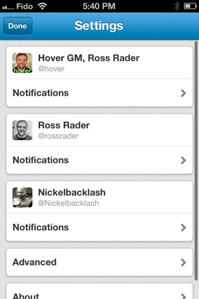
IMG 0389

This is in addition to the IOS Twitter settings under System Preferences.
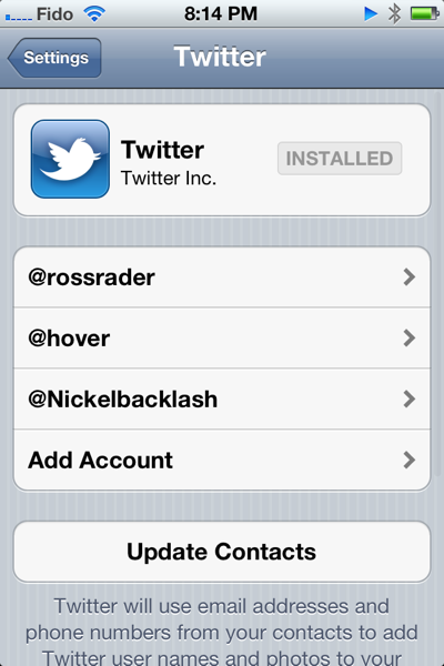
Photo

Why aren’t all of these settings nicely tucked into the IOS System Preferences settings for Twitter? As is, it will be really confusing for users to figure out where they should be going to tweak which settings and provides a user with two different means of adding new accounts to the application.

This is supposed to be “a faster, simpler way to stay close to everything you care about“. I think Twitter has missed that mark by a mile.

It will be extremely interesting to see how the company reacts to user feedback about these changes. At the same time, they’ve announced some pretty sweeping changes to how their website works as well. Their documentation draws some exceptionally clear parallels between the mobile app and the web app. I can only hope that their web app gets it a lot more right than the mobile app did.

My overall feeling is that they are re-arranging the UI deck chairs while skirting the more central issue of how to absorb the early user-hacks into real and scalable features within their user experience.

I suppose I could just uninstall it.
 

By

Register.com Still Playing Transfer Games 10 Years Later

10 years after ICANN first implemented its inter-registrar domain transfer policy, Register.com is still leading the way in customer-hostile game playing that serves no real purpose other than to stem the bleed of customers away from their high prices and poor service. Here’s a recent email that I received from them when I tried to transfer a domain name away from them…

You recently requested an auth code to transfer your “somesillytestdomainname.com” domain name.
Your request has been processed and at this time it has been declined due to recent suspicious activity in your account.

Register.com is committed to providing the most secure and reliable domain services for our customers.
We have implemented specific security measures to help prevent unauthorized transfer of domains to another registrar.
The type of suspicious activity that could have caused your request to be declined includes:
- Multiple failed attempts to login to customer’s account
- Recent changes to the account holder’s name, email address, or login ID
- Attempts to access the account over the phone without authorization
- Recent changes to the accounts password
- Domain name lock not removed
- Recent changes to billing or credit card information

To receive your auth code, please call one of our customer service consultants at 1.888.734.4783. They will confirm you to the account and then fulfill your request.

Thing is, most auth code requests receive this type of a response. From what I understand, it is basically impossible to retrieve an auth code from them via the web.

This is one of the reasons we work so hard at Hover to understand what other registrars are up to and invest so much in systems and processes that help customers move their domains. Most of them are playing games, making it virtually impossible for regular people to move their business to a new registrar without jumping through a myriad of self-serving hoops. If you ever want to move your domains to Hover from a hostile provider like Register.com, feel free to give us a call and let us take care of the details. It certainly beats having to get a PH.D (Doctorate in Domains) just to move your business to a new provider.

(and yeah, I’ve heard the whole “we are worried about our customers security” argument a thousand times before. Domain hijacking is no more prevalent at registrars that don’t play transfers games than their are at ones that do.)

By

My customers, not your eyeballs

SaaS is a great model and I especially like how it can solve small business problems very quickly. Using a web service instead of developing custom code in-house can really decrease the amount of time it takes to develop a new idea and launch it into the market.

One of my requirements for web services is that my brand takes prominence over theirs. Some services are better at this than others, and I’m fairly forgiving on this point – sometimes the URLs aren’t as clean as I would like or our ability to brand the service is limited, but generally SaaS providers understand the importance of helping us put our brand in front of our customers.

Most SaaS providers offer this enhanced branding as an upsell from their free offer. No cash mean no branding – this makes total sense to me. This arrangement is essentially an advertising relationship where I let the SaaS provider advertise their brand to my customers in exchange for free use of their service. In some cases, I’m also really cool with this arrangement but for the most part, I prefer to just pay up and take advantage of the branding for my benefit.

I ran across one provider this week that seems to want the best of both worlds. They want me to pay for their service (no free option) and their solution is heavily branded with links and logos to entice my customers to use their service. Thinking that I must have missed something, I sent an email to their customer support team asking how I can turn off their branding.

Their response was that they had no plans to offer this feature in the near future. I wasn’t really surprised at the response, but I was definitely taken aback by the temerity of their strategy. Do they really think this is a sustainable way to grow their business?

In essence, their business model presumes that I will pay them money so that they can advertise to my customers.

Screw that. My relationship with my customers is important and precious – there’s no way that I’m going to distract them with someone else’s corporate messaging in this way.

We’ll be moving to a new solution soon.


By

Bullet Time, Wet

If you are familiar with the technology behind the original “bullet time” effect in the Matrix, you will really appreciate how trick this commercial’s production is – getting all of those cameras on the water is no small feat. Watch this one in full screen.

Rip Curl Mirage Campaign from Time-Slice® Films on Vimeo.

Check out Core 7 for more details.

By

Trick or treat!

Halloween 2Dpumpkins rev

Have a safe and happy Halloween everyone! More importantly, don’t forget that the Christmas season starts tomorrow!

By

Undernet on your Smartphone

This comment on Scripting.com was quite exciting for me. Using Smartphones to implement point-to-point services using old “BBS” style technology – diallers, modems and the like.

Exceedingly easy to implement, and potentially quite powerful in its impact.

Imagine clicking a link on a web page that caused your phone to dial a number, negotiate a connection and allowed two different handsets to exchange data on a private link that was completely disconnected from the Internet?

This is a *very* cool idea.

By

Excerpt, Gnomologia

I was Googling some old sayings this evening, and came across an old tome called “G NO MOLOGIA: PROVERBS; Wise SENTENCES Witty SAYINGS, Ancient and Modern, Foreign and British.”

Here are just a few of the neat sayings that I came across in a quick skim – recognize any of them?

‘Tis easier to know how to speak, than how to be silent.
‘Tis net the Action, but the Intention, that is good or bad.
‘Tis not the Beard, that makes the Philosopher.
‘Tis not your Posterity, but your Actions, that will perpetuate your Memory.
‘Tis the Horse that stumbles, and not the Saddle.
‘Tis the last Feather, that breaks the Horse’s Back.
To be employ’d in uselete Things, is half to be idle.


By

Microsoft’s Strategy

“…I’m king of the hill – top of the heap… A number one, top of the list…”

- Sinatra, “New York, New York”


Its funny, Microsoft used to be *the thing*. They were the king of the hill, top of the heap, A number one.

Not so anymore.

I mean, they still have a really great business, a lot of really good assets and they seem to have a lot of great ideas, but their performance is really in the shitter.

I was thinking about this earlier today, so I went to their website – first time in years. I was a bit surprised. It didn’t feel like a credible website in the least. Cluttered, distracting and all the copy was distilled into just a few obtuse words. I suppose someone might have felt that obtuse created mystery and intrigue that was suppose to somehow get people to click-through or something. I mostly just found it annoying.

Poking around a bit to get a better sense of their priorities, I came across this page and it struck me what most ails Microsoft these past few years.

Everything is strategy.

Windows Live, the Cloud, Mobile, blah, blah, blah, blah. And worse, I think the folks in charge in Redmond actually believe that their strategy is going to sell software.

Steve Ballmer – you used to be a sales guy, what sells software? That’s right. Not Strategy.

Ballmer & Co. need to pull their collective heads out of The Cloud and remember one thing. Microsoft is a software company, not a strategy company. If they want to win, they have to get back to shipping great software that people use everyday. Software that Microsoft is uniquely positioned to provide. In the meantime, they are getting beat, every single day, by thousands of app developers, by Apple, by Samsung, by Google and most every startup between San Jose and Oakland, and there isn’t any strategy in the world that can change that for them.


By

The VISA Shakedown

I think VISA* might hate its merchants.

Get this.

When someone uses a stolen credit card to buy something from a merchant, the actual card holder will usually dispute the charge with VISA. VISA will then credit the card holder and charge the merchant a processing fee (usually about $10 or so).

At this point the merchant is out of pocket for any merchandise they shipped, plus the $10 handling fee they have to pay to VISA.

If this happens often enough, VISA will levy a fine against the merchant. This could be tens of thousands, and in the worst cases, hundreds of thousands of dollars. If the merchant doesn’t pay, their ability to accept credit cards will be revoked.

Thing is, VISA is the one that approved the purchase in the first place! They have no real safeguards in place to ensure that the person requesting the transaction is the actual cardholder. They’ve implemented a few half-hearted attempts to provide cardholder security in the past – chips and PIN numbers, but their basic security model is so fundamentally flawed that it is almost trivial to circumvent.

VISA is very slow to move away from changing their model because the current process is all upside for them – they make a huge profit from the transaction and processing fees and carry very little of the risk themselves and put the real burden of security on the cardholder and merchant.

Yuck.

*Mastercard and AMEX are no better.